HTML Responsive web design
What is Responsive Web Design?
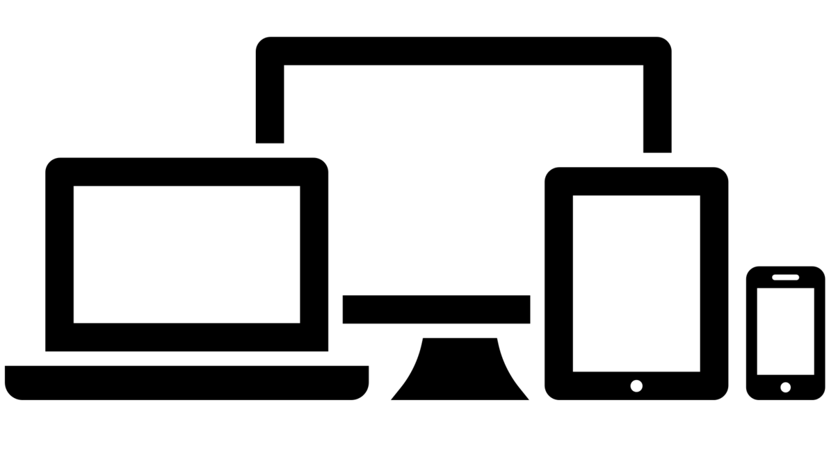
Responsive Web Design is about using HTML and CSS to automatically resize, hide, shrink, or enlarge, a website, to make it look good on all devices (desktops, tablets, and phones):
Responsive Images
Responsive images are images that scale nicely to fit any browser size.
Using the width property
If the CSS width property is set to 100%, the image will be responsive and scale up and down:

Notice that in the example above, the image can be scaled up to be larger than its original size. A better solution, in many cases, will be to use the max-width property instead.
Using the max-width Property
If the max-width property is set to 100%, the image will scale down if it has to, but never scale up to be larger than its original size:

Show Different Images Depending on Browser Width
The HTML <picture> element allows you to define different images for different browser window sizes.
Resize the browser window to see how the image below changes depending on the width:

Responsive text size
The text size can be set with a "vw" unit, which means the "viewport width".
That way the text size will follow the size of the browser window:
Resize the browser window to see how the text size scales.
Viewport is the browser window size. 1vw = 1% of viewport width. If the viewport is 50cm wide, 1vw is 0.5cm.
Media Queries
In addition to resize text and images, it is also common to use media queries in responsive web pages.
With media queries you can define completely different styles for different browser sizes.
Example: resize the browser window to see that the three div elements below will display horizontally on large screens and stack vertically on small screens:
Menu
Content
Example:
float: left; width: 20%; }
.main {
foat: left;
width: 20%;
}
.main {
float: left;
width: 60%;
}
@media screen and (max-width: 800px) {
.left, .main, .right {
width: 100%;
}
}
</style>
Responsive Web Page - Full Example
A responsive web page should look good on large desktop screens and on small mobile phones.
Responsive Web Design - Frameworks
All popular CSS Frameworks offer responsive design.
They are free, and easy to use.
W3.CSS
W3.CSS is a modern CSS framework with support for desktop, tablet, and mobile design by default.
W3.CSS is smaller and faster than similar CSS frameworks.
W3.CSS is designed to be independent of jQuery or any other JavaScript library.
W3.CSS Demo
Resize the page to see the responsiveness!
London
London is the capital city of England.
It is the most populous city in the United Kingdom, with a metropolitan area of over 13 million inhabitants.
Paris
Paris is the capital of France.
The Paris area is one of the largest population centers in Europe, with more than 12 million inhabitants.
Tokyo
Tokyo is the capital of Japan.
It is the center of the Greater Tokyo Area, and the most populous metropolitan area in the world.
Bootstrap
Another popular CSS framework is Bootstrap. Bootstrap uses HTML, CSS and jQuery to make responsive web pages.