HTML <picture> Element
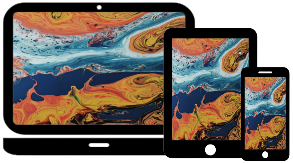
The HTML <picture> element allows you to display different pictures for different devices or screen sizes.
The HTML <picture> Element
The HTML <picture> element gives web developers more
flexibility in specifying image resources.
The <picture> element contains one or more <source> elements, each referring to different images
through the srcset attribute. This way the browser can choose
the image that best fits the current view and/or device.
Each <source> element has a media attribute that defines when the image is the most
suitable.
Example:
Show different images for different screen sizes:
<source media="(min-width: 650px)" srcset="image1.jpg"
<source media="(min-width: 450px)" srcset="image2.jpg"
<img src="img.jpg">
</picture>
Note: Note: Always specify an img element as the last child element of the picture element. The img element is used by browsers that do not support the picture element, or if none of the source tags match.
When to use the picture Element
There are two main purposes for the <picture> element:
1. Bandwidth
If you have a small screen or device, it is not necessary to load a large image file. The browser will use the first <source> element with matching attribute values, and ignore any of the following elements.
Format Support
Some browsers or devices may not support all image formats. By using the <picture> element, you can add images of all formats, and the browser will use the first format it recognizes, and ignore any of the following elements.
Example:
<source srcset="img1.jpg">
<source srcset="img2.jpg">
<img src="img.jpg"> alt="an image" style="width: auto;">
</picture>
Note: The browser will use the first <source> element with matching attribute values, and ignore any following <source> elements.